Improving the readability of the new design of legislation.gov.uk in Firefox with custom CSS
I love legislation.gov.uk. It’s an amazing resource, and I’m very grateful to the team behind it.
I also like - mostly - the new, cleaner, design.
But I am not a fan of the changes to readability.
What’s changed
It used to look like this:
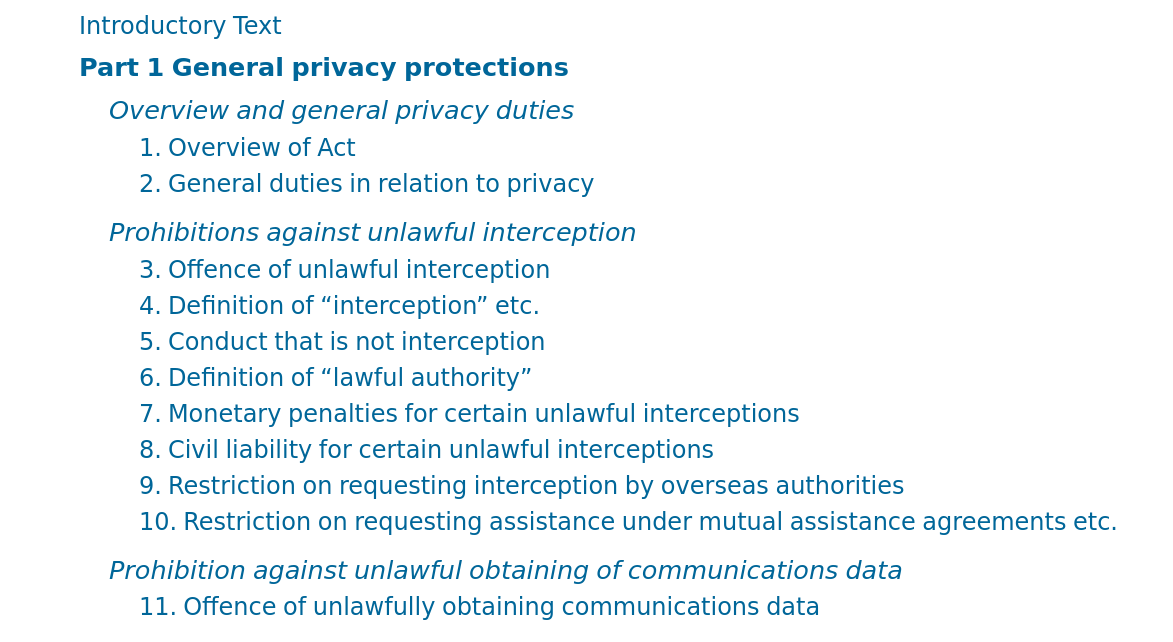
Now it looks like this:
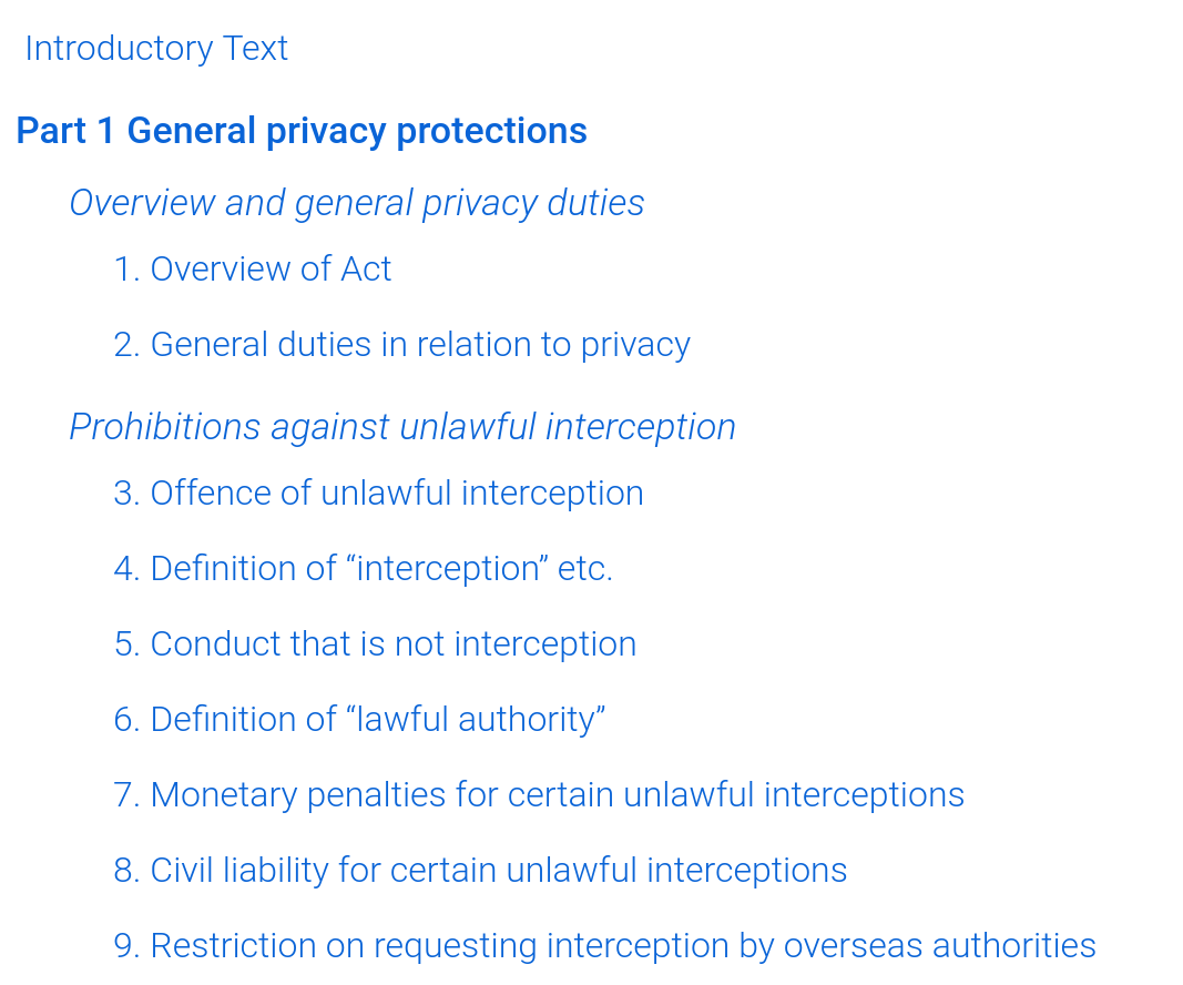
It’s not dreadful, but I find it harder to read, with the light blue, thin text, against a bright white background.
Fixing it in Firefox
I’ve sent feedback to the team, but I want to fix it for myself now.
Using the “Stylus” add-on for Firefox, I created a new stylesheet for www.legislation.gov.uk.
In it, I put:
@-moz-document domain("www.legislation.gov.uk") {
    body, .LegSnippet .LegAnnotations :not(.LegAnnotationsGroupHeading), #leg .pageTitle .pageTitleToggleLink, #printOptions h4, .legToc .LegSnippet *, ul#legSubNav li a.close, .ui-widget, .LegSnippet .ENContents a.userFunctionalElement span, ol li ol li p.ENContentsTitle a, #search #ui-datepicker-div .ui-datepicker-title, #search #ui-datepicker-div .ui-datepicker-calendar th, #tools #refineSearch form input[type="text"]:disabled, #content div .searchCol2 input[type="text"]:disabled, .legResources h3 em, #survey-banner .banner-close, .LegSnippet .LegBlockNotYetInForceHeading span, .english::after, .welsh::after, ul#legSubNav li a, #breadCrumb ul li a, #legSubNav a, h3 .help, ol li ol li p.ENContentsTitle a em, #new-design-banner button, ol li.ENContentsAnnex a, ol li.ENContentsAnnex a span{ font-weight: 400;}
}
The page now looks like this:
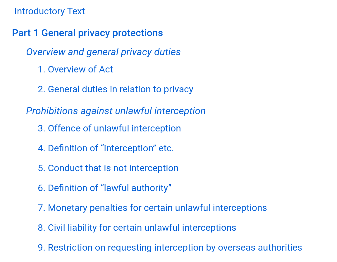
I might tinker with the font too but, for now, that’s an immediate improvement for me.
Update: I’ve made the font a bit darker, and now it is even better.
Update
I received a friendly, positive response from the legislation.gov.uk team.